LAVAZZA COFFEE
packaging design / branding
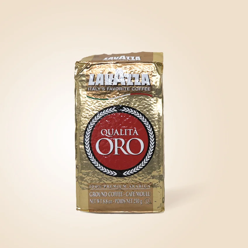
This is a packaging redesign for Lavazza’s Qualità Oro ground coffee. Despite being a well-known coffee brand in Italy and abroad, many of Lavazza’s products suffered from unappealing packaging and thereby failed to stand out in a crowded and highly competitive market.
In the first stage of the project, I performed a thorough analysis of the existing product’s flaws, which include:
Form – an unpleasantly hard, brick-like shape with unintended sharp edges
Material – non-degradable, non-resealable foil packaging
Graphics – outdated aesthetics and confusing information hierarchy
I then conducted market research to better understand Lavazza’s brand values, users, unique competitive advantages, as well as the strengths and weaknesses of similar coffee products on the market.
The Concept
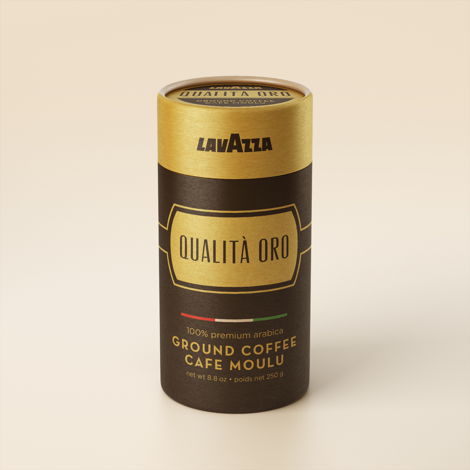
The original brick-like foil packaging is replaced with a cardboard tube, which is not only sustainable and easy to recycle, but also helps to distinguish Lavazza from its competitors – most of whom use a resealable foil bag.
The new visual design retains the overall themes of the original packaging (gold, premium, high-quality), but features a more luxurious colour palette and Art Deco-style typography that recalls Lavazza's Italian identity.


